


You’re probably not a professional writer, so you may be excused for not realizing if your website copy isn’t “readable”. After all, it’s in plain English, right? But readability is more than that. AJ Kohn points out the importance of readability on your website:
Readability is about making your content accessible and comfortable. Never make it a chore. If you make your content difficult to read the value of that content goes down. Lack of readability frustrates comprehension and reduces sharing. This, in turn, limits the social echo of your content and lowers the chances of it obtaining organic links.
Here’s your clue: Heed the warning sign of a high bounce rate.

If you have a bounce problem, you may have a readability problem.
When readability is compromised, you’re also losing valuable visitors who are all potential customers.
Readability is certainly related to the words you use and your sentence structure; that may determine the reading level or grade of your content. But it’s much more than just that. There are things other than your words that can make your content easy to read or difficult to follow.
Here are some important readability factors to consider
People Don’t Read, They Scan
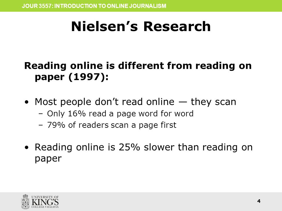
Noted usability expert Jacob Nielsen conducted a study that found that users “read at most 28% of the words during an average visit; 20% is more likely.”
Use Font Size Smartly
Headings and subheadings need to be clear. You need a hierarchy of font sizes, and possibly even colors and boldness, to help the reader immediately grasp the structure of your content. I start with a body font size of 16 points in my own blog, and headings & subheadings are clearly larger. Also, think of your headings as representing the structure of your content, much like an outline.
Use Subheadings
Subheadings don’t just visibly demonstrate the structure of your content. They also improve your readability by making your content less dense and, as a result, less intimidating.
Use a Legible Font

Avoid infatuation with artistic fonts. Make sure your body text and headings are all legible. Some fonts become difficult to read in bold, and research has shown that some fonts that are easy to read on paper are not as easy to read on a computer screen.
My preference is for serif fonts for printing and sans serif fonts for web content. Simple is better; I recommend fonts like Arial, Humanist, and Century Gothic. I typically use the same font family for headings. But since headings are larger you may be able to take more leeway there. Here are some font suggestions to consider.
Pay Attention to Line Height
If the lines of text on your screen are too close together, that reduces your readability. A good rule of thumb is to use a line height of about 1.5, but that can vary depending on your choice of font. The goal is to avoid your text looking cramped or looking too spread out.
Watch Your Color Contrast

Be cognizant of your text color in comparison to the background color. Inadequate contrast can have a dramatic impact on readability and eye fatigue.
I like black text on a white background, and absolutely hate the popular fashion of using gray text instead of black. Colored backgrounds are fine, but pay attention to the color of the text to make sure it’s easily readable.
Use Highlights
Don’t be afraid to italicize or bold important words or phrases – or even whole sentences – so that your most important content stands out. If you’re particularly brave, you might decide to use color or highlighting so the importance stuff jumps off the page.
Shorten Your Paragraphs

And don’t be afraid of one-sentence paragraphs either.
Watch Those Long Sentences
Just like a long paragraph, a long sentence compromises readability. If the user has to parse the sentence grammatically to understand it, it’s too long. The Yoast SEO plug-in for WordPress discourages too many sentences that are more than about 20 words. I agree. A couple of long sentences spread across the entire page or blog post are okay, but too many of them can drive people away.
Use Pronouns With Care

In a conversation, it’s easy to know what pronouns are referring to. If I talk about that here, the “that” obviously relates to using pronouns. That’s the antecedent. But if the antecedent is in a previous paragraph, and the person scanning through your content alights on the current paragraph, they’ve missed the antecedent. It’s not obvious what the word “that” is referring to.
Repeating nouns instead of referring to them with pronouns may have an added benefit in that nouns are more valuable to the search engines understanding your content than pronouns are. Just try to avoid being “over-redundant”with those nouns.
Preserve Some White Space
Your content – and your readers – need a little space to breathe. Inadequate white space on the page is one of those things that triggers the TL:DR response. Headings and subheadings, bullet lists, and images all help to increase white space on your page.
Avoid Distractions
In general, you want your visitor to read and absorb your content. You may want them to take action, like download something or buy something, or contact you. Don’t break the flow of your user’s concentration on your content. Distractions are a conversion-killer.
Sliders with rotating images, colorful banner ads, and pop-ups that obliterate some of your content are almost always counterproductive. Be particularly careful about pop-ups. Google refers to those as “intrusive interstitials” and they can damage your page experience. That’s important because page experience is a new and increasingly important part of Google’s ranking algorithm.
Images Can Help Readability

Always use at least one image on every page. I like to insert images with text wrapping around them. They serve many purposes — they can:
Effectively illustrate a point you’re making.
- Draw the eye to a particular spot on your page.
- Make your page more memorable.
- Add a little white space around the image, and white space makes content less intimidating.
- Make a long paragraph appear less dense.
- Add color to a mostly black-and-white page.
- Make your page more approachable which translates into better readability.
Maintain Paragraph Transitions
You don’t want staccato content. Your material needs to flow, to maintain the focus of your reader and ensure comprehension. So try to ensure a natural for progression from paragraph to paragraph by using transition words like ‘and”, “so”, “because”, and even “thus” or “therefore”.
When you maintain that flow, you retain the reader’s attention.
Pay Attention to Your Reading Level
There are a few ways to judge the reading difficulty of your content:
- How many sentences in the paragraph?
- What’s the average number of words in a sentence?
- How many syllables in a word (on average)?
There are a number of tests to determine your reading level. Perhaps the most widely known is the Flesch-Kincaid readability test. That test calculates a reading grade level, calibrated for US readers. The Yoast SEO plug-in for WordPress evaluates reading level using the Flesch reading ease score.
You can get a reading level score online at a few places:
Don’t Obsess Over Keywords
Keep your keyword phrases in mind, but whatever you do, avoid keyword stuffing in a misguided attempt to get better rankings in Google. Not only is it a readability nightmare, it’s also a red flag to Google that can hurt your visibility rather than help it.
Results

Perhaps you want your reader to subscribe to your newsletter. Maybe you want them to call your office to ask questions or request a consultation. Or perhaps you want them to buy a product.
The goal of your carefully constructed readable content is to entice the reader to move down the sales funnel and take the action you want.
Make sure you include appropriate and compelling calls to action on your page for your reader to take the action you want them to.